Ansel
Ansel modernizes supplemental health insurance with a tech-driven Member Portal and mobile app. The platform moves beyond traditional coverage management by blending financial support with seamless, user-centric digital tools for a more efficient health coverage experience.
Ansel
Ansel modernizes supplemental health insurance with a tech-driven Member Portal and mobile app. The platform moves beyond traditional coverage management by blending financial support with seamless, user-centric digital tools for a more efficient health coverage experience.
COMPANY
Ansel
Role
Senior Product Designer
COMPANY
Ansel
Role
Senior Product Designer
COMPANY
Ansel
Role
Senior Product Designer

Project Details
Understanding user challenges
Ansel is a digital health insurance platform focused on modernizing how users access and manage supplemental coverage through web and mobile experiences.
As part of product evolution, the focus shifted to improving how users submit and track claims—one of the most critical and high-friction moments in the experience.
Objective
Simplify the claim submission process
Reduce administrative overhead
Improve transparency with real-time updates
Increase user adoption and engagement
Insight & Problem
Through discovery and user research, we identified that users struggled with slow, complex, and unclear claim submission processes.
Key challenges:
Claim submission required too much effort and time
Users were unsure what documentation was needed
Interfaces felt complex, especially for less tech-savvy users
Lack of visibility created uncertainty after submission
Key insight:
Users don’t want to manage insurance—they want a fast, clear way to complete tasks with confidence.
Approach (Design Thinking)
Defined proto-personas representing different user needs (tech-savvy vs non-tech-savvy users)
Mapped the end-to-end claim journey from discovery to tracking
Identified friction across onboarding, submission, and follow-up
Iterated through wireframes → prototypes → feedback cycles
Validated solutions through usability testing and stakeholder alignment
Product Solution
Designing the experience
Step-by-step flow → simplified claim submission into 3 clear steps
Flexible documentation upload → allowing submission with minimal requirements
Contextual guidance → helping users understand what to provide
Real-time feedback → keeping users informed at every stage
Cross-platform consistency → unified web and mobile experience
Solution
A streamlined, user-centered claim submission experience:
3-step claim flow: input → upload → review & submit
Document assistance modal to guide users
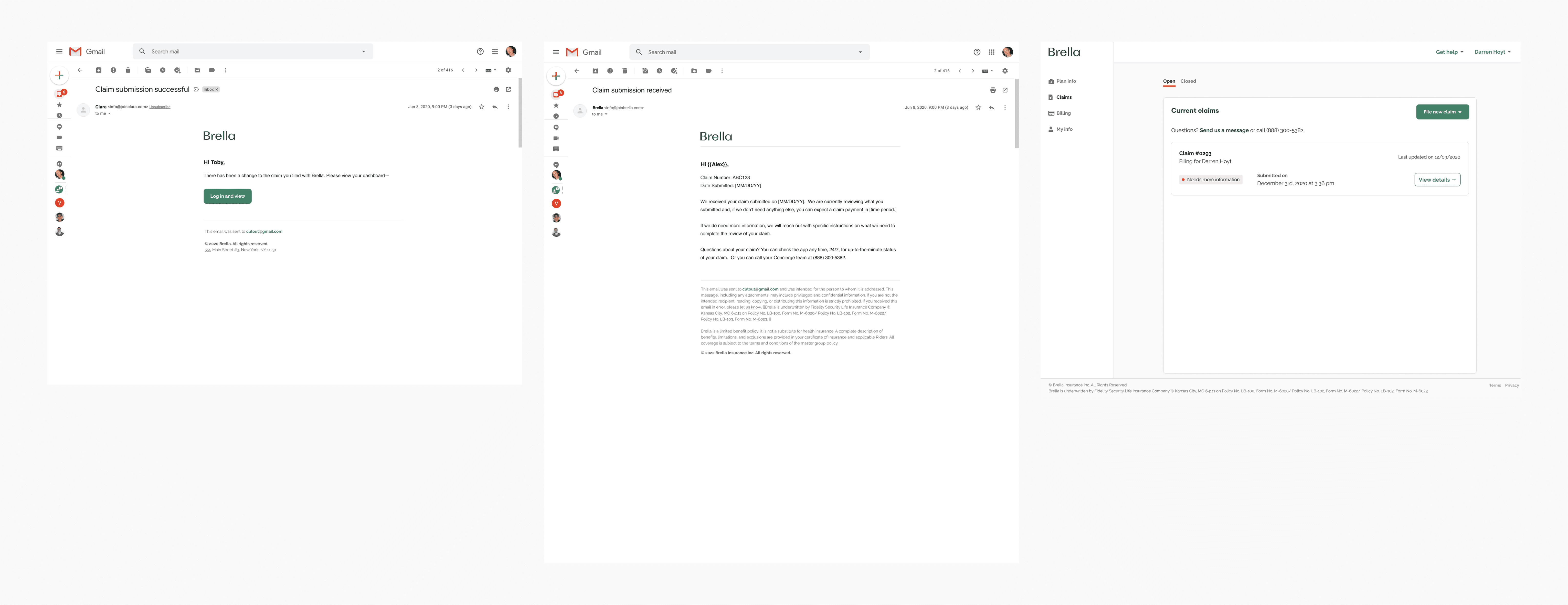
Real-time tracking dashboard with status updates
Push notifications and email confirmations
Claim history and transparency across interactions
Backend integration (Salesforce) to ensure efficient internal processing
The experience shifts from complex workflows → guided, intuitive interactions
Every step, designed as a production-ready frame.
Once the flow was validated, each step became a high-fidelity frame in Figma. The complete journey lives side by side on one page: the desktop member portal and the iOS app, including the in-between moments that usually get skipped, like guidance, processing and confirmation.
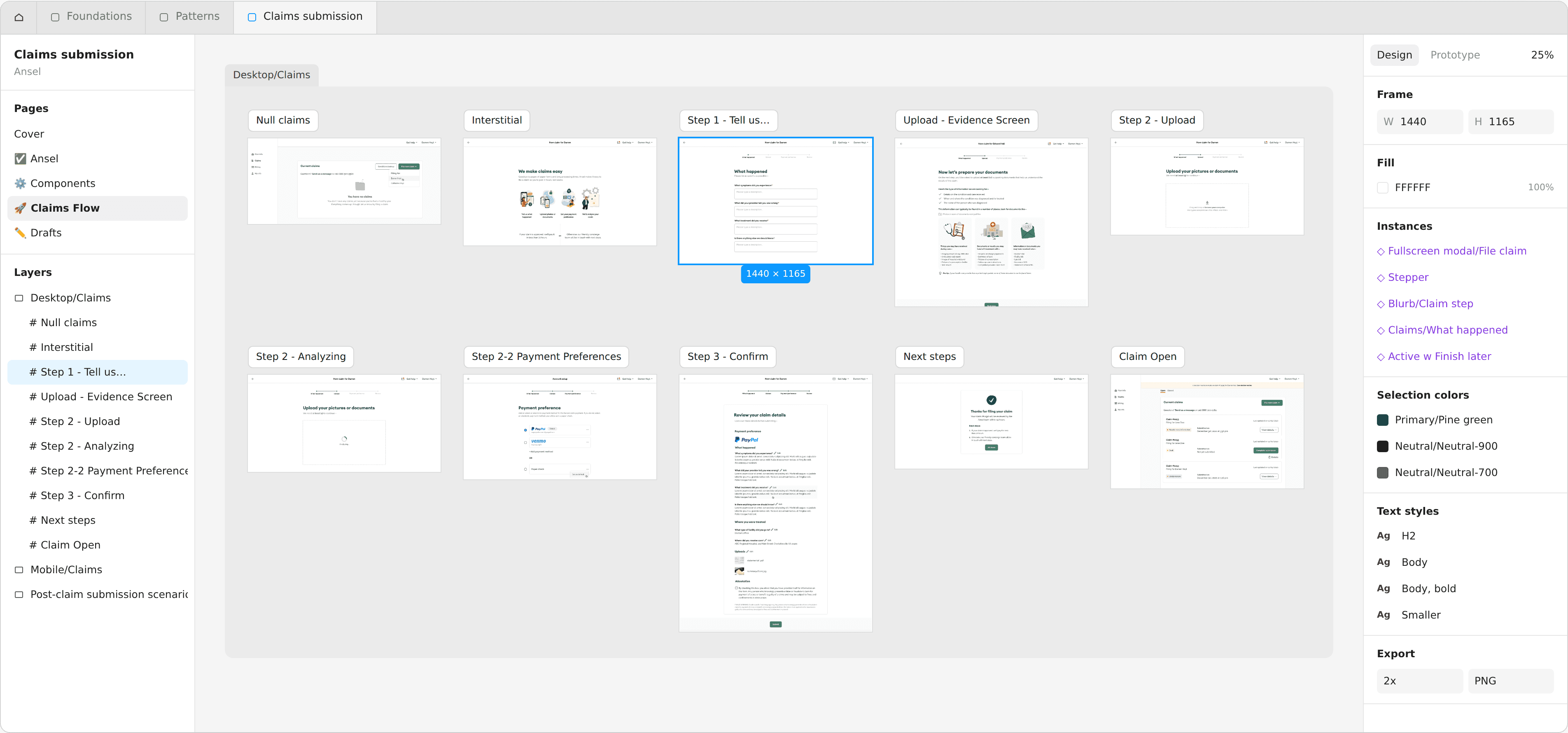
Desktop/Claims. Ten frames from an empty claims list to tracking. The selected frame shows what it's built from: the full-screen modal header, stepper, form block and action bar.
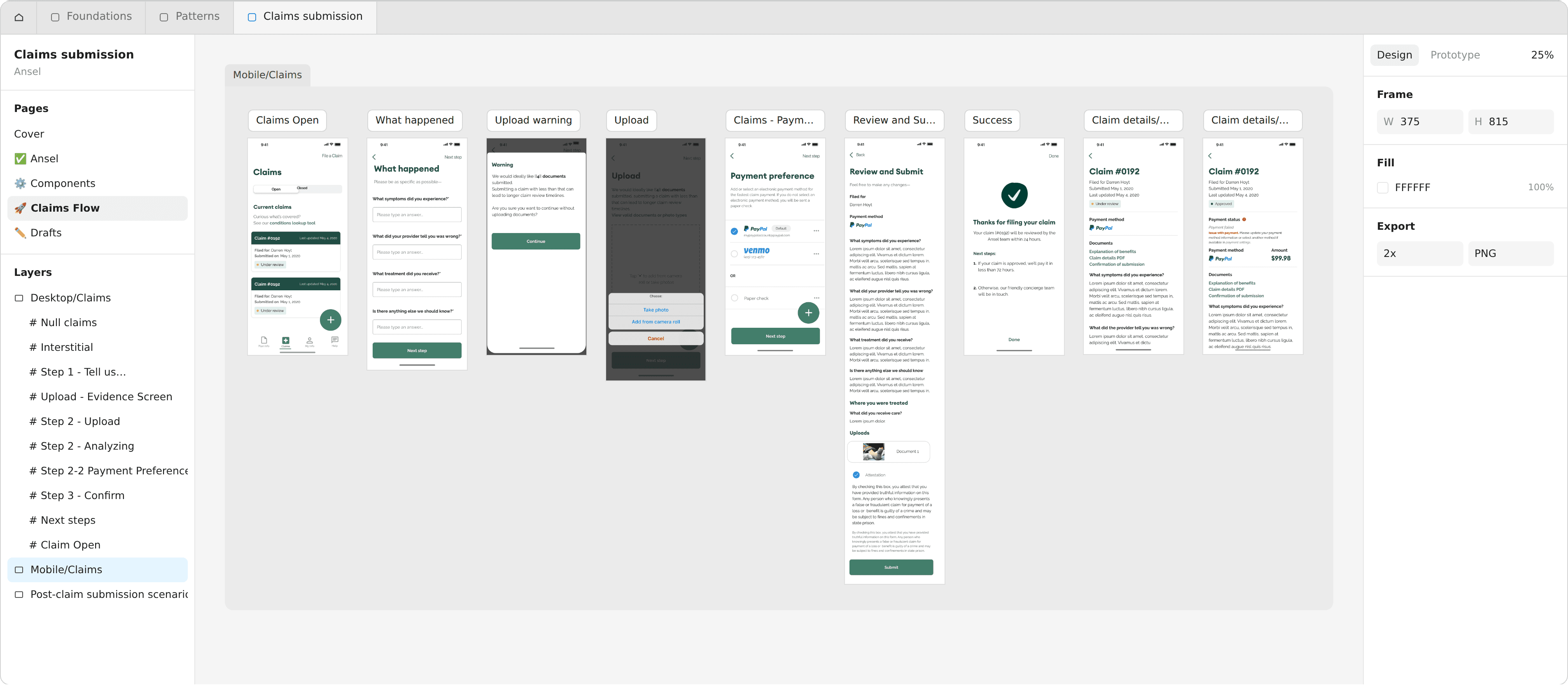
Mobile/Claims. The same journey on iOS, plus the moments unique to mobile: the camera action sheet, an upload warning, and post-submission claim states.
Design system / Reusable patterns & states
Reusable components and interaction patterns created consistency across workflows while accounting for different states, edge cases and user needs. The claims work sits on four linked libraries: Foundations, Patterns, Screens and the Claims file itself.
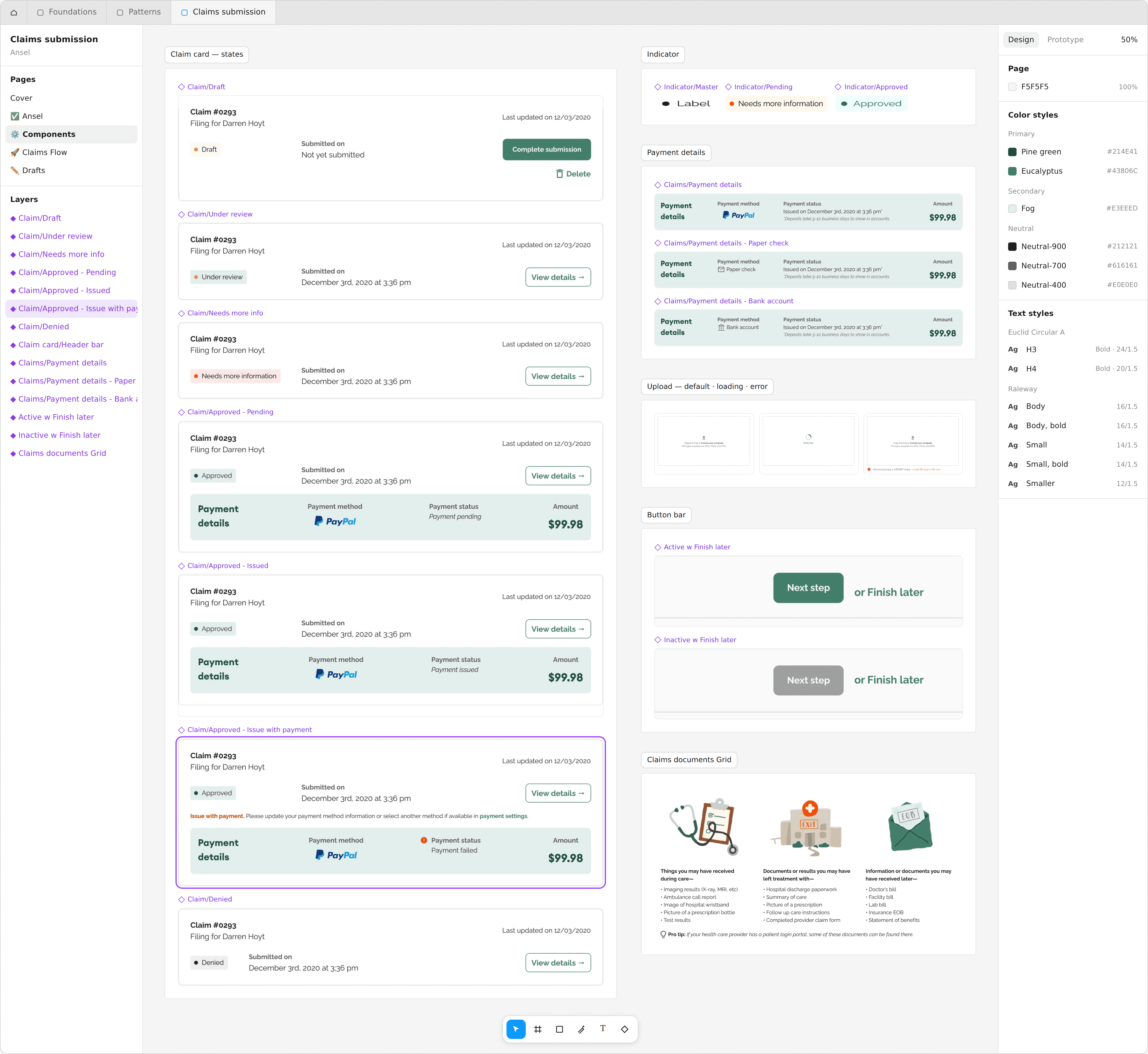
Components. The claim card in every lifecycle state, with the supporting components and the color and text styles they use.
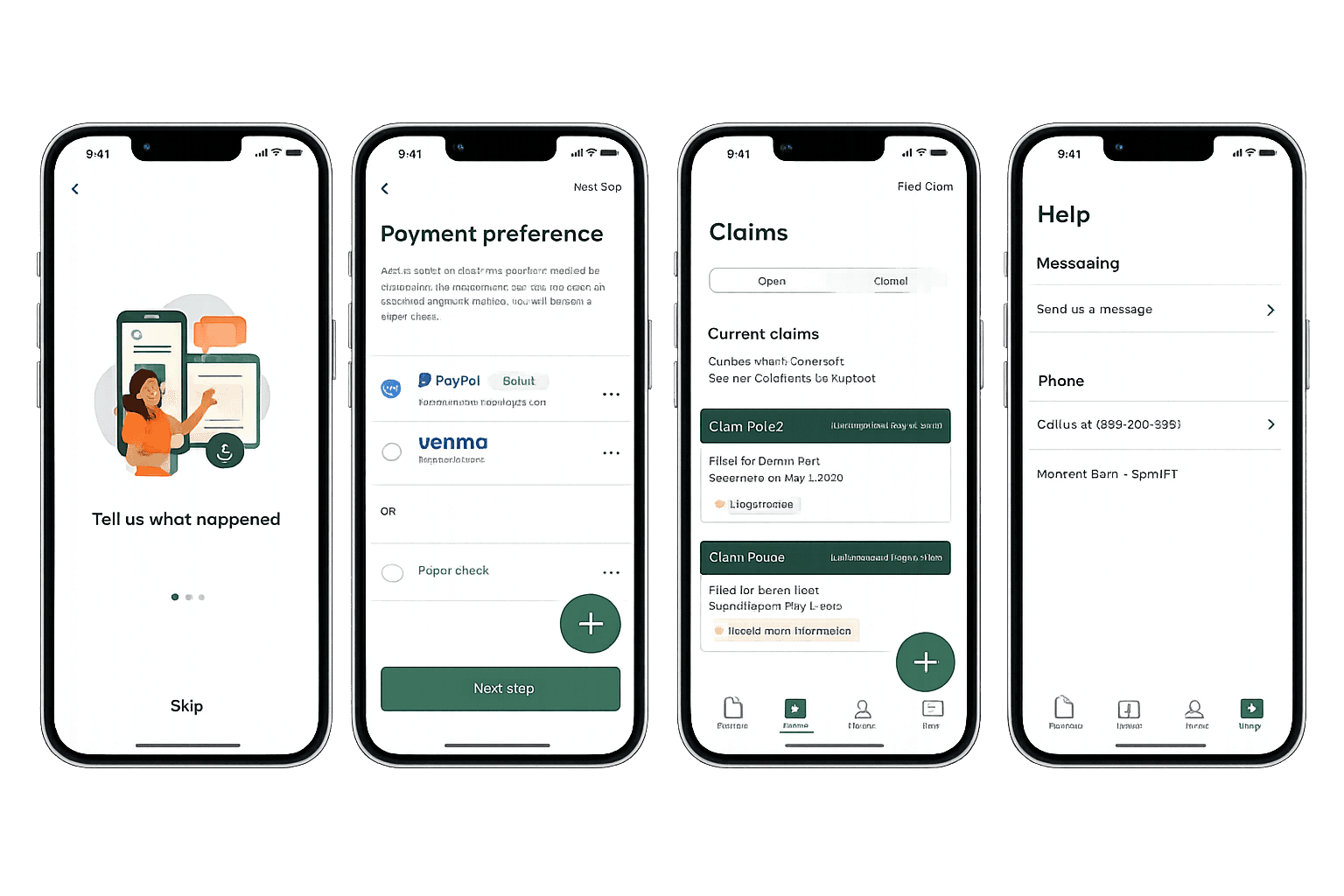
Submit claim mobile flow

Mobile view
Outcome
Users can now:
Submit claims quickly with minimal friction
Understand what’s required without confusion
Track progress in real time
Feel confident and supported throughout the process
Impact
Users can now:
60%+ of claims submitted through the mobile experience
Reduced administrative workload and processing time
Improved efficiency in internal workflows
Strengthened perception of Ansel as a user-friendly digital platform
Project Details
Understanding user challenges
Ansel is a digital health insurance platform focused on modernizing how users access and manage supplemental coverage through web and mobile experiences.
As part of product evolution, the focus shifted to improving how users submit and track claims—one of the most critical and high-friction moments in the experience.
Objective
Simplify the claim submission process
Reduce administrative overhead
Improve transparency with real-time updates
Increase user adoption and engagement
Insight & Problem
Through discovery and user research, we identified that users struggled with slow, complex, and unclear claim submission processes.
Key challenges:
Claim submission required too much effort and time
Users were unsure what documentation was needed
Interfaces felt complex, especially for less tech-savvy users
Lack of visibility created uncertainty after submission
Key insight:
Users don’t want to manage insurance—they want a fast, clear way to complete tasks with confidence.
Approach (Design Thinking)
Defined proto-personas representing different user needs (tech-savvy vs non-tech-savvy users)
Mapped the end-to-end claim journey from discovery to tracking
Identified friction across onboarding, submission, and follow-up
Iterated through wireframes → prototypes → feedback cycles
Validated solutions through usability testing and stakeholder alignment
Product Solution
Designing the experience
Step-by-step flow → simplified claim submission into 3 clear steps
Flexible documentation upload → allowing submission with minimal requirements
Contextual guidance → helping users understand what to provide
Real-time feedback → keeping users informed at every stage
Cross-platform consistency → unified web and mobile experience
Solution
A streamlined, user-centered claim submission experience:
3-step claim flow: input → upload → review & submit
Document assistance modal to guide users
Real-time tracking dashboard with status updates
Push notifications and email confirmations
Claim history and transparency across interactions
Backend integration (Salesforce) to ensure efficient internal processing
The experience shifts from complex workflows → guided, intuitive interactions
Every step, designed as a production-ready frame.
Once the flow was validated, each step became a high-fidelity frame in Figma. The complete journey lives side by side on one page: the desktop member portal and the iOS app, including the in-between moments that usually get skipped, like guidance, processing and confirmation.
Desktop/Claims. Ten frames from an empty claims list to tracking. The selected frame shows what it's built from: the full-screen modal header, stepper, form block and action bar.
Mobile/Claims. The same journey on iOS, plus the moments unique to mobile: the camera action sheet, an upload warning, and post-submission claim states.
Design system / Reusable patterns & states
Reusable components and interaction patterns created consistency across workflows while accounting for different states, edge cases and user needs. The claims work sits on four linked libraries: Foundations, Patterns, Screens and the Claims file itself.
Components. The claim card in every lifecycle state, with the supporting components and the color and text styles they use.
Submit claim mobile flow
Mobile view
Outcome
Users can now:
Submit claims quickly with minimal friction
Understand what’s required without confusion
Track progress in real time
Feel confident and supported throughout the process
Impact
Users can now:
60%+ of claims submitted through the mobile experience
Reduced administrative workload and processing time
Improved efficiency in internal workflows
Strengthened perception of Ansel as a user-friendly digital platform
Project Details
Understanding user challenges
Ansel is a digital health insurance platform focused on modernizing how users access and manage supplemental coverage through web and mobile experiences.
As part of product evolution, the focus shifted to improving how users submit and track claims—one of the most critical and high-friction moments in the experience.
Objective
Simplify the claim submission process
Reduce administrative overhead
Improve transparency with real-time updates
Increase user adoption and engagement
Insight & Problem
Through discovery and user research, we identified that users struggled with slow, complex, and unclear claim submission processes.
Key challenges:
Claim submission required too much effort and time
Users were unsure what documentation was needed
Interfaces felt complex, especially for less tech-savvy users
Lack of visibility created uncertainty after submission
Key insight:
Users don’t want to manage insurance—they want a fast, clear way to complete tasks with confidence.
Approach (Design Thinking)
Defined proto-personas representing different user needs (tech-savvy vs non-tech-savvy users)
Mapped the end-to-end claim journey from discovery to tracking
Identified friction across onboarding, submission, and follow-up
Iterated through wireframes → prototypes → feedback cycles
Validated solutions through usability testing and stakeholder alignment
Product Solution
Designing the experience
Step-by-step flow → simplified claim submission into 3 clear steps
Flexible documentation upload → allowing submission with minimal requirements
Contextual guidance → helping users understand what to provide
Real-time feedback → keeping users informed at every stage
Cross-platform consistency → unified web and mobile experience
Solution
A streamlined, user-centered claim submission experience:
3-step claim flow: input → upload → review & submit
Document assistance modal to guide users
Real-time tracking dashboard with status updates
Push notifications and email confirmations
Claim history and transparency across interactions
Backend integration (Salesforce) to ensure efficient internal processing
The experience shifts from complex workflows → guided, intuitive interactions
Every step, designed as a production-ready frame.
Once the flow was validated, each step became a high-fidelity frame in Figma. The complete journey lives side by side on one page: the desktop member portal and the iOS app, including the in-between moments that usually get skipped, like guidance, processing and confirmation.
Desktop/Claims. Ten frames from an empty claims list to tracking. The selected frame shows what it's built from: the full-screen modal header, stepper, form block and action bar.
Mobile/Claims. The same journey on iOS, plus the moments unique to mobile: the camera action sheet, an upload warning, and post-submission claim states.
Design system / Reusable patterns & states
Reusable components and interaction patterns created consistency across workflows while accounting for different states, edge cases and user needs. The claims work sits on four linked libraries: Foundations, Patterns, Screens and the Claims file itself.
Components. The claim card in every lifecycle state, with the supporting components and the color and text styles they use.
Submit claim mobile flow
Mobile view
Outcome
Users can now:
Submit claims quickly with minimal friction
Understand what’s required without confusion
Track progress in real time
Feel confident and supported throughout the process
Impact
Users can now:
60%+ of claims submitted through the mobile experience
Reduced administrative workload and processing time
Improved efficiency in internal workflows
Strengthened perception of Ansel as a user-friendly digital platform
